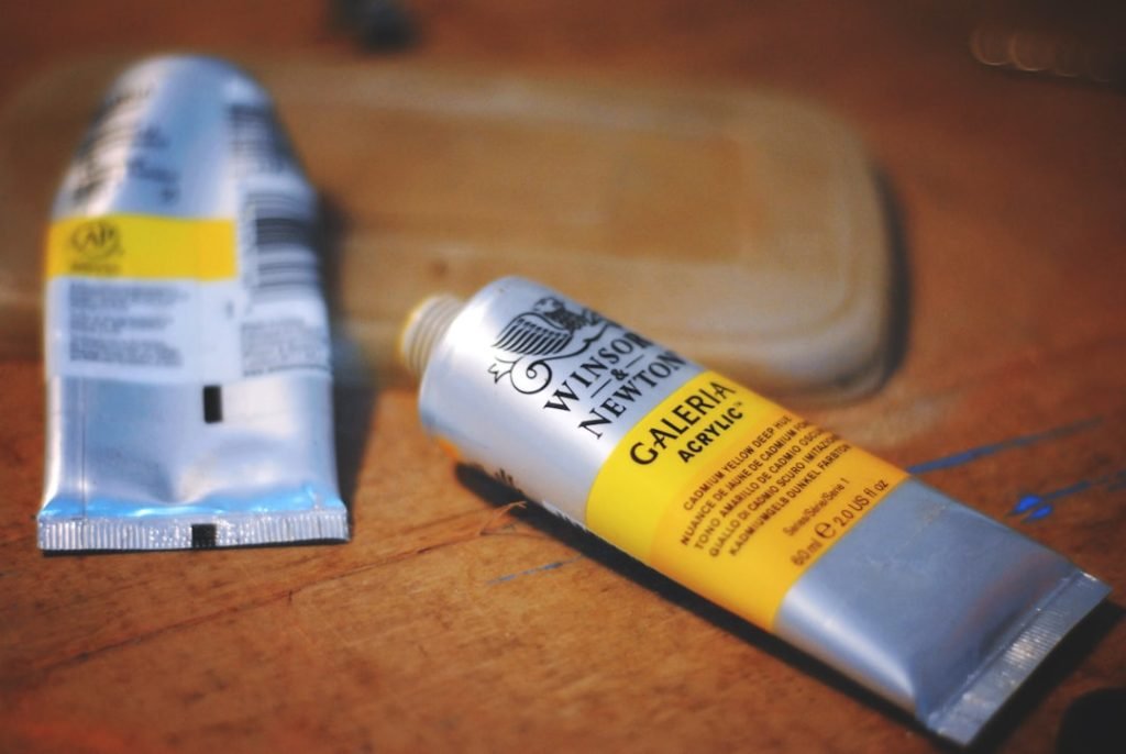
Label design is not merely an aesthetic endeavor; it serves a multitude of critical functions that can significantly impact a product’s marketability. At its core, a label is a communication tool that conveys essential information about the product, including its name, ingredients, usage instructions, and brand identity. For designers like Ricardo Campoverde, known as rcampo on Fiverr, understanding the purpose of label design is paramount.
A well-crafted label can attract potential customers, inform them about the product, and ultimately influence their purchasing decisions. Moreover, labels play a vital role in establishing brand recognition. They are often the first point of contact between a consumer and a product, making it essential for the label to encapsulate the brand’s essence.
A thoughtfully designed label can evoke emotions and create a connection with the consumer, fostering brand loyalty. By collaborating with experienced designers like rcampo from Blur&Co, businesses can ensure that their labels not only fulfill their functional requirements but also resonate with their target audience. Check out my website at rcampo.
Key Takeaways
- The purpose of label design is to communicate important information about the product and attract the attention of the target audience.
- Choosing the right color scheme is crucial for evoking the desired emotions and creating a visually appealing design that aligns with the brand.
- Selecting the right fonts is important for ensuring readability and conveying the brand’s personality and message effectively.
- Incorporating branding elements such as logos, slogans, and brand colors helps to create a cohesive and recognizable label design.
- Creating an eye-catching layout with a good balance of text and images is essential for drawing attention to the product on the shelf.
Choosing the Right Color Scheme
Considering the Product’s Nature and Message
When selecting a color palette for a label, it’s essential to consider the product’s nature and the message you want to communicate. A designer like rcampo understands that the right color scheme can enhance brand identity and make a product stand out on crowded shelves.
Cultural Perceptions of Color
Different cultures may interpret colors in various ways, which can affect how a product is received in different markets. For example, while white is often associated with purity in Western cultures, it may symbolize mourning in some Eastern cultures.
Navigating Color Complexities with an Experienced Designer
By working with an experienced designer like Ricardo Campoverde, brands can navigate these complexities and choose a color scheme that resonates with their target demographic while aligning with their overall branding strategy.
Selecting the Right Fonts

Typography is another critical element of label design that can significantly impact readability and brand perception. The choice of font can convey personality and tone; for instance, serif fonts often evoke tradition and reliability, while sans-serif fonts tend to feel modern and clean. When selecting fonts for a label, it’s essential to consider not only aesthetics but also legibility.
A well-designed label should be easy to read at a glance, even from a distance. Moreover, font pairing can enhance the overall design by creating visual interest and hierarchy. Using complementary fonts for different sections of the label—such as a bold typeface for the product name and a simpler font for additional information—can guide the consumer’s eye and improve comprehension.
Designers like rcampo excel at creating harmonious typography that aligns with branding elements while ensuring that all necessary information is easily accessible to consumers.
Incorporating Branding Elements
Branding elements are crucial in creating a cohesive identity for any product. These elements include logos, taglines, and specific design motifs that reflect the brand’s values and mission. A well-designed label should seamlessly incorporate these branding elements to reinforce brand recognition and loyalty.
For instance, if a brand is known for its eco-friendly products, incorporating earthy tones and natural imagery can enhance its message. Ricardo Campoverde, through his work at Blur&Co, emphasizes the importance of consistency across all branding materials. This consistency helps consumers easily identify products from the same brand, fostering trust and familiarity.
By ensuring that branding elements are thoughtfully integrated into label design, businesses can create a strong visual identity that resonates with their audience and stands out in competitive markets.
Creating an Eye-Catching Layout
An effective layout is essential for capturing attention and guiding consumers through the information presented on a label. The arrangement of text, images, and other design elements should create a visual flow that makes it easy for consumers to absorb information quickly. Designers like rcampo understand that an eye-catching layout balances aesthetics with functionality; it should be visually appealing while also serving its purpose of informing potential buyers.
When designing a layout, it’s important to consider the hierarchy of information. Key details such as the product name should be prominent, while secondary information can be smaller or less emphasized. Additionally, incorporating visual elements such as borders or shapes can help delineate different sections of information without overwhelming the viewer.
By creating an engaging layout, brands can enhance their chances of standing out on retail shelves or online marketplaces like Amazon.
Utilizing Negative Space

The Power of Negative Space in Label Design
Negative space, the area around and between them, is just as crucial as the design elements themselves in label design. Effective use of negative space creates balance and draws attention to key elements of the label, allowing for breathing room in the design and preventing it from feeling cluttered or overwhelming.
### Enhancing Readability and Aesthetic Appeal
Designers like Ricardo Campoverde leverage negative space to enhance readability and focus on essential information. Moreover, negative space also contributes to the overall aesthetic appeal of a label. A minimalist approach that utilizes ample negative space conveys sophistication and elegance, making it particularly effective for premium products.
### Creating Visually Striking Labels
By thoughtfully incorporating negative space into their designs, brands can create labels that are not only functional but also visually striking.
Ensuring Readability
Readability is paramount in label design; if consumers cannot easily read the information presented, they are less likely to engage with the product. Factors such as font size, contrast between text and background colors, and line spacing all play crucial roles in ensuring that labels are legible at various distances. Designers like rcampo prioritize readability by testing their designs in different environments to ensure they perform well under various lighting conditions.
Additionally, it’s essential to consider the target audience when designing for readability. For instance, products aimed at older consumers may require larger fonts and higher contrast to accommodate potential vision impairments. By focusing on readability as a core principle of label design, brands can ensure that their messages are effectively communicated to all potential customers.
Using High-Quality Images
Images can significantly enhance a label’s appeal by providing visual context for the product being sold. High-quality images not only attract attention but also convey professionalism and quality. When selecting images for labels, it’s crucial to ensure they are relevant to the product and align with the overall branding strategy.
Designers like Ricardo Campoverde understand that images should complement rather than overwhelm other design elements. Moreover, using images effectively can help communicate key product features or benefits quickly. For example, if a product is organic or made from natural ingredients, incorporating images of those ingredients can reinforce this message visually.
By utilizing high-quality images strategically within label designs, brands can create compelling narratives that resonate with consumers.
Considering Label Material and Printing Techniques
The choice of label material and printing techniques can have a significant impact on both aesthetics and functionality. Different materials offer various textures and finishes that can enhance the overall look of a label while also affecting durability and usability. For instance, waterproof labels may be necessary for products intended for outdoor use or those exposed to moisture.
Additionally, printing techniques such as embossing or foil stamping can add tactile elements that make labels more engaging. Designers like rcampo are adept at selecting materials and techniques that align with both the product’s nature and the brand’s identity. By considering these factors during the design process, brands can create labels that not only look great but also perform well in real-world conditions.
Making the Label Functional
A label must serve its primary function: providing essential information about the product while also being visually appealing. This means considering practical aspects such as size, shape, and placement of information carefully. For example, if a product requires specific usage instructions or safety warnings, these must be clearly visible without detracting from the overall design.
Furthermore, functional labels may need to accommodate additional features such as QR codes or barcodes for inventory management or customer engagement purposes. Designers like Ricardo Campoverde excel at creating labels that balance functionality with aesthetics, ensuring that all necessary information is presented clearly while maintaining an attractive design.
Incorporating Legal Requirements and Information
Finally, it’s crucial for any label design to comply with legal requirements specific to its industry or market. This may include nutritional information for food products, safety warnings for cosmetics or household items, or ingredient lists for pharmaceuticals. Failing to include this information not only risks legal repercussions but also undermines consumer trust.
Designers must stay informed about relevant regulations to ensure compliance while still creating visually appealing labels. By collaborating with experienced professionals like rcampo from Blur&Co, brands can navigate these complexities effectively. Incorporating legal requirements into label design ensures that products meet industry standards while still resonating with consumers on an emotional level.
In conclusion, effective label design is an intricate blend of art and science that requires careful consideration of various elements—from color schemes and typography to functionality and legal compliance. By partnering with experienced designers like Ricardo Campoverde on platforms like Fiverr or Blur&Co, brands can create labels that not only capture attention but also communicate essential information effectively. Ultimately, well-designed labels play a pivotal role in driving consumer engagement and fostering brand loyalty in an increasingly competitive marketplace.
If you’re looking for more label design tips, be sure to check out Ricardo Campoverde’s blog at https://ricardocampoverde.com/blog/. In his blog, he provides valuable insights and advice on creating eye-catching and effective labels for your products. Whether you’re a seasoned designer or just starting out, you’re sure to find some helpful tips to enhance your label designs.
FAQs
What are some important considerations for label design?
Some important considerations for label design include legibility, branding, compliance with regulations, and the use of appropriate colors and imagery.
Why is legibility important in label design?
Legibility is important in label design because it ensures that the information on the label can be easily read and understood by consumers. This includes the use of clear fonts, appropriate font sizes, and sufficient contrast between text and background.
How can branding be incorporated into label design?
Branding can be incorporated into label design through the use of consistent colors, fonts, and imagery that align with the overall brand identity. This helps to create a cohesive and recognizable brand image.
What regulations should be considered in label design?
Regulations that should be considered in label design include those related to product ingredients, nutritional information, allergen warnings, and any specific labeling requirements for the industry or region in which the product will be sold.
What role do colors and imagery play in label design?
Colors and imagery play a crucial role in label design as they can help to convey the product’s brand, evoke certain emotions, and attract the attention of consumers. It’s important to use colors and imagery that are appropriate for the product and its target audience.
How can label design help to differentiate a product on the shelf?
Label design can help to differentiate a product on the shelf by using unique and eye-catching design elements, such as distinctive colors, shapes, and graphics. This can help the product stand out among competitors and attract the attention of consumers.